Masculine design

Cut Out the Glitz for Some Glam

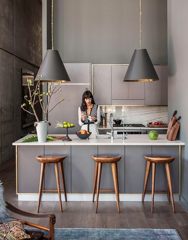
We are loving the latest kitchen trend, using matte finishes which really pays tribute to the natural beauty of the finish. When selecting finishes look for matte, sanded, brushed or honed.

The large scale pendant light fixtures are to die for and the matte finishes make this space, with all hard surfaces, feel soft and serene.

In this updated Farm House kitchen, there is an air of simplicity, but the true beauty is in the details. The use of concrete floors with a wide plank ceiling infuse the perfect balance of rustic and urban. The juxtaposition of the concealed hardware and exposed dovetail joinery on the cabinetry is beautiful.

The rich color palette in this handsome kitchen is relaxing and soothing. We love how the venting is tucked away and the gorgeous range is showcased in it's own nook.

While we adore white Carrera marble, this honed piece of Calacatta gold marble adds depth and drama, and really warms up the concrete wall finish.


Cheers to trends, this one is a keeper!

An Architect's Master Bath Design

Here in San Francisco space is at a premium, so making the most of the square footage in your home is essential. Many homes have that hard to use, slanted ceiling closet that is just not where you want to start every morning when it's time to get dressed. Gregg, our Principal Architect, had just that space. He's been envisioning transforming this small closet into his dream master bath. His project finally made the job list.


First things first, in order to square off the ceiling for more usable space, the ceiling/roof had to be punched through, creating a dormer. Once approved, demo began and it was time to design the look and feel of the space.


The ocean and the beach have always resonated with Gregg so when a friend gave him these photos, he knew they would be his design inspiration. With a beautiful, timeless, yet masculine color palette, the search for finishes began.

A matte glass mosaic tile from Artistic Tile - The Tozen Collection in Silk Oxygen with gorgeous blues and browns was selected to cover a full wall in the shower. This is the first thing you see upon entering. To make the small space feel larger, a large format tile from Country Floors - Ecocem Porcelain Collection in Melted Ice with a honed finish was used for the other shower walls and the floor. A watery blue grey paint, sophisticated enough for a master bath finished the other walls. Dunn Edwards - Color: Lake Placid.


A floating vanity with a white counter top and a dark wood base also help to make a small space feel larger and airy. Bringing in a wood element adds warmth to a bathroom full of hard surfaces and can also connect an updated space to the roots of a traditional home. Vanity finishes include Caesarstone solid surface in Torquay and Aspen Oak Wood laminate from E.B. Bradley. Designed in-house and built by Kenwood Cabinetry in San Francisco.  We cannot say enough wonderful things about Ken Fong and his work. Thank you!

Another key design element in any space is lighting. Gregg did not skimp here. The vanity lighting is flush and inlaid for an ultra clean look. Under cabinet lighting for the vanity provides a soothing ambience at night. Overall recessed lighting in the space and shower is dimmable and all are on their own switches for efficiency.


With every bathroom design we create at DM+A, the toilet, as nice as it may be, must not be the focal point. With this small space we tucked it behind the vanity.


Not only does Gregg love his new bath, his feline love, Jakers, can often be found lounging on the luxurious radiant heat floors. Cheers to a job well done and long overdue!