DM+A Redfin Feature : "Building a New House with Limited Space" by Mike Cahill

“When I remodel an old house,

I look at space that is eaten…”

——Originally published on Redfin——

Trying to build a new house from the ground up can be a daunting but rewarding task. One of the biggest advantages of building new is the ability to design everything to your exact specifications. However, sometimes design plans are hindered by the amount of space you have to work with. When building on a restrictive plot of land it can be difficult to ensure that you are getting the most out of your home and your land. That’s why we’ve reached out to the experts in home design from Portland to Philadelphia to provide you with ways to optimize the design and layout of your home when working with limited space.

Have an architectural program ready

Right-sized homes don’t happen by accident. They come about through thoughtful planning and design. To fully realize the potential of a small plot of land it’s important to begin with a careful study of your space requirements. In the world of architectural design, this is commonly referred to as an “Architectural Program”. It’s a specific and complete list of your space requirements. In the hands of a skilled architect, this list will form the foundation of a design that’s both space-efficient and inspirational. – Harry Hunt Architects

Make your home work smarter with dual-purpose spaces

When you are confronted with the dilemma of limited space it requires you to be more creative with circulation and room usage. You may need to provide rooms that will provide a dual purpose such as a study/family room or kitchen with island seating which would be your breakfast area. If your kitchen is very tight you may consider a corner banquette seating. It takes some squeezing to get situated but it saves floor space. Furniture may need to be oriented to allow circulation through a room eliminating hall space. Bedroom furniture such as bunk beds or raised beds with a desk below are also space savers. An office can also serve as a guest room by providing a pull-out couch. – Aric Gitomer Architect

To make the most of your limited space, design with a dual purpose. Most homeowners seldom use their foyer as the main entry. Instead of leaving the space unused, turn it into a functional area such as a home office. Staircases are also prime real estate that can serve multifunctions. Consider a stacked, exposed staircase, and tuck a wine cellar or reading corner beneath the stairwell, for total optimization. – John Lum Architecture

To make your home work smarter due to space constraints, design your bathroom as a spa-experience versus a utilitarian space. Rain head showers and deep soak tubs can turn a bath into a spa. Also, rethink the sink. Ask yourself, do I really need two sinks and all that plumbing? Negative space can make a bathroom feel bigger. Combined with an open plan kitchen which extends the room while removing the boxed-in feeling, a small footprint can have maximum living (and resale) value. – Studio SHK

First, minimize the impact of vehicles on the square footage of the lot.  Limit area devoted to circulation and combine uses when possible.  Bring in views with expansive floor to ceiling glass to increase the perception of the area by leading the eye beyond the walls. – Mark A Silva Architect

Circulation is key

It’s all about circulation. Old houses tend to be compartmentalized; the easiest thing is to remove doors that remain open most of the time. When I remodel an old house I look at space that is eaten by pathways. Opening the dining room to the kitchen makes your kitchen bigger and more useful. – De Meza + Architecture Team

Narrow or constrained lot sizes can be a challenge when designing a new home, but can also result in unique, carefully designed and beautiful spaces.  H2D Architecture + Design approaches space constraints with thinking about a design that flows efficiently and graciously between the spaces horizontally and also vertically between the floors.  Open floor plans which combine uses, such as living, dining and kitchen areas, help to reduce the need for extra circulation spaces, as well as utilizing open stairs between floors in the design can help create the feel of a larger space. – H2D Architects

Let there be light

Light is essential when dealing with smaller spaces. A well-lit space can give the impression of largeness without the actual footprint size.  Large glass walls taken from floor to ceiling to adjacent walls can allow for small spaces to open up visually and connect to the outside.  Accordion doors are a favorite product to physically open up the interior space to exterior living.  On restrictive lots, tall garden walls provide privacy and intimacy even in the face of density. – Tomecek Studio Architecture

Natural light is key when it comes to small spaces. Pairing light colors with big windows can make a small space feel huge. Adding a mirror or two will also help reflect light and add depth, visually. – Carbon Architects

Optimize unused space for storage

Many times issues of space ultimately affect precious home storage. As a result, consider clever ways to maximize the space often allocated to essential design features. For example, a staircase’s rise and run create a unique storage opportunity that is often wasted. In the past, I have made each stair act as a drawer. – Larry E. Boerder Architects

Avoid double-height rooms

First, avoid double-height rooms, it takes up a large portion of your buildable area. Instead, go with taller ceilings throughout. Second, carve out exterior basement rooms, it creates more unique spaces and extends the basement space for those beautiful warm nights. They’re also great for direct access to and from the backyard if you plan on having a pool. – RS Mannino

Fluid indoor and outdoor spaces

Designing beautiful and useful homes while optimizing limited space is our core strength at D3 Architects. We always talk to clients about making sensible, connected spaces and not throwing away money on finishing wasted space. This thought process begins with the site or the outside.  Consider two things in particular: the orientation of your spaces to daylight (the qualities of daylight are different from the N, S, E, and W) and the connections to the outdoor spaces you will use. After that, the most important thing is thinking about flows of movement.  Consider how you will move around your house, say from the entry to the kitchen, and then the movement within each space, for example, how you would ideally like to prepare a meal in the kitchen, moving from the stove to the refrigerator to the sink, all while being able to keep an eye on the kids playing outside. If you map these relationships out thinking about your own family’s priorities, living in your home will always be a pleasure. – D3 Architects

Large covered porches, accessed by quad-slider doors (which open up 6ft in the center) can make a small home live dramatically larger.  An open floor plan with high ceilings (9-10ft) can also help make a house feel larger than its square footage.  Lastly, if we’re constrained in size, we emphasize quality over quantity – this shows up in “Not So Big House” ideas such as extra built-ins to keep everything organized and uncluttered. – Rodwin Architecture and Skycastle Construction

Less is more 

As the partner of an architectural practice in London for many years, high property costs meant space was always a premium and forced us to become experts in designing homes with limited space both inside and out. Since returning to the US, I often rely on this knowledge. Limit material selections and the rooms will flow as one. Keep spaces flexible – double or triple their function and always design them to accommodate change in the future. Design houses with seamless transitions from inside to out, utilizing large floor-to-ceiling doors and windows and importantly if the same floor finish inside continues out to open-air spaces, i.e. patios or covered porches, the room will effortlessly extend out and feel much bigger. There are many great tricks a good designer can and will use to make limited space feel grand. – Architecture Joyce Owens

When working with small spaces keep materials to a minimum, using the same materials on the floor throughout your rooms.  When choosing wall colors, pick colors that reflect light. Your furniture should have multiple uses and be lighter in weight where they can be easily moved from space to space when needed. – Streamline Architects

Take advantage of 3D modeling

It’s hard to optimize the rooms in your home without being able to visualize the spaces beforehand. By modeling in SketchUp, you can get a good sense of space in 3D, rearrange furniture to test different layouts, experiment with different materials & textures, and design for the space you have. You can also go up! See what your small footprint would look like as a two or three-story building! – SketchUp

Build Vertically

It’s not unusual to see three, or even 4-level homes that make great use of interior glass, open staircases and strategic layouts. Many companies now offer residential elevators that take up surprisingly little square footage, and the breezes and views from that top floor can be amazing! Don’t be afraid of a nontraditional floorplan. A talented designer or architect can even make a triangular room work for your lifestyle. Additionally, be sure to shop for appliances and furnishings carefully. Many top-tier brands now offer down-sized ranges, refrigerators, and furniture that fit a more compact, urban lifestyle without having to sacrifice quality. – Modern Architecture + Design Society

Read between the studs

 It’s standard to recess a medicine cabinet between wall studs, but why not take advantage of that “free” space elsewhere? For small bathrooms, we’ll often put a tall cabinet recessed in the wall that’s great not just for medicine, but for all those other small items you want in the bathroom, or the six bottles of shampoo you bought on Amazon, but don’t have space to store elsewhere in your small house. And if your wall is framed with 2×6 studs rather than 2×4, that cabinet can even hold rolls of toilet paper. – Mikiten Architecture

Know exactly what you want

When designing a house with limited space, a conversation on a homeowner’s vision for efficient living needs to be had with the architect before starting the design process. This is so appropriate design goals that support this vision can be organized. A designer can use the wall cavities for storage, raise the ceilings to provide clerestory light, fabricate custom built-in furniture fit to small dimensions and employ other design tricks but if there is not the preexisting appetite for simplicity and efficiency by the homeowner then it will not be possible for the architect to turn a house’s limited space into unique design opportunities. Rooms tend to get bigger with each design review by the homeowner in a residential project if the homeowner does not hold onto a succinct vision supported by specific efficiency goals. An architect experienced in energy efficiency, construction and interior design will be able to organize appropriate design goals with a homeowner’s vision for living with less. Nick Dean Architect

One's Trash is Another's Treasure

In our search for that perfect wood veneer for wall paneling in a master bedroom, we found this silver Eucalyptus from Exotic Hardwoods. Not only is the product gorgeous, it comes with a fascinating history and bonus dinner party conversation too.

silver eucalyptus cropped.jpg

The Eucalyptus tree is native to Australia with over 600 species. Miners returning to California from the Australia Gold Rush likely brought seeds of the Tasmanian Blue Gum (eucalyptus globulus) and other eucalypts with high hopes of striking it rich. They believed this exotic miracle tree could boost the timber and fuel industries, conquer malaria and improve air quality, but as it turned out, of all the species available, they brought home the least workable species. The trees had failed to live up to the many premature claims and hopes.

E. Globulus Albion, CA

Today, the Eucalyptus tree is one of the most widely planted, non-native trees in California. Up and down the coast from Humboldt county down to San Diego, you'll find Eucalyptus used as wind screen. These fast-growing trees provide shade that cools the environment and they are also amazing filters to aid in cleaning up the air.


However, because the tree is so fast growing, Eucalyptus are categorized as an invasive species because it spreads and grows very quickly. This invasive species makes it difficult for native plants to survive by shading them out, so in order to manage the species, many are used as firewood. Fortunately for us, Exotic Hardwoods is salvaging the E. Globulus species also known as Blue Gum. Many thanks to them for turning the environments trash into our interior treasures.


The Square offices in San Francisco installed this Eucalyptus wood veneer from Exotic Hardwoods. What a beautiful salvage!

Exotic Hardwoods offers Eucalyptus in a natural finish, colored in a silver finish or fumed black. For more information and fun facts on this product, call Bob Nichols of Exotic Hardwoods.


Show Me the Light - Work in Progress

The beauty of the design business is the challenge to create whatever it is our clients desire. Our latest client called on DM+A to open up his living room and flood it with light, but still provide privacy. After walking the clients penthouse unit in San Francisco, we knew the solution to add the largest possible skylight was the way to go.


8' x 12' is the maximum size allowed for the Lutron Tensioned Roller Shade system, which will provide a flooding of light and the tensioned shades will provide for privacy. This system will keep the shades taut with the least possible amount of sag.


Rollamatic Roofs, manufacturer of retractable roofs and operable skylights, will install the skylight to provide the room with light and ventilation. They are also providing the double pane low-e glass which conforms to Title 24 requirements for energy efficiency. Big thanks to them for the referral.


Now, here is the piece de resistance, Luminii's Kilo Recessed System. We will recess this LED light system along the perimeter of the skylight well to provide a warm halo of dimmable light.

Here's how Netflix installed the light system in their San Jose office.

Stay tuned for an updated post once the project is complete.


Give us a call if you would like more information on passing the stringent codes and Title 24 Energy Efficiency standards required for a project like this.


Cut Out the Glitz for Some Glam

We are loving the latest kitchen trend, using matte finishes which really pays tribute to the natural beauty of the finish. When selecting finishes look for matte, sanded, brushed or honed.

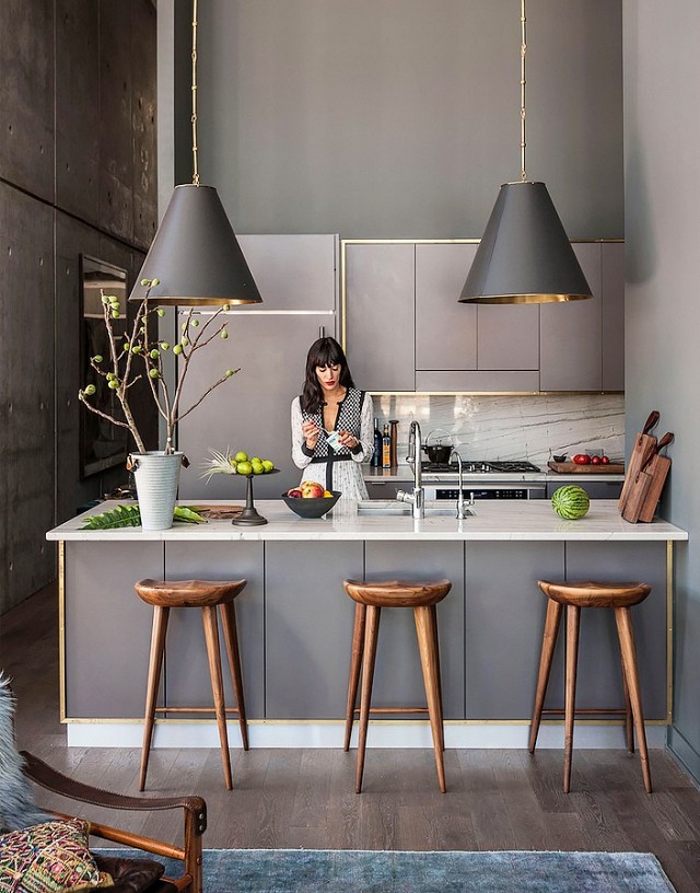
The large scale pendant light fixtures are to die for and the matte finishes make this space, with all hard surfaces, feel soft and serene.

In this updated Farm House kitchen, there is an air of simplicity, but the true beauty is in the details. The use of concrete floors with a wide plank ceiling infuse the perfect balance of rustic and urban. The juxtaposition of the concealed hardware and exposed dovetail joinery on the cabinetry is beautiful.

The rich color palette in this handsome kitchen is relaxing and soothing. We love how the venting is tucked away and the gorgeous range is showcased in it's own nook.

While we adore white Carrera marble, this honed piece of Calacatta gold marble adds depth and drama, and really warms up the concrete wall finish.


Cheers to trends, this one is a keeper!

Creating Space

It's amazing how a new product can shape a space and create another area of the home to enjoy. Our client had a corner of outdoor space that was set up with seating to take in the city view, but it was never an area anyone ever utilized. Until...drum roll, please, we had a Concrete Works Tender Hemisphere fire pit installed.

This fire pit is available in 6 gorgeous neutrals, 5 different sizes and an option for electronic ignition or match lit. The lava rocks are so beautifully tumbled and come in 3 different colors.  An infill cover is available as an add on option which converts the pit into a table. This product can be customized to suit your space and needs.


Thanks, Concrete Works for this gorgeous fire pit!

What is that?

Art is not what you see, but what you make others see.” Edgar Degas.


The famous quote reminded me to share this story because I have seen this image of one of our projects, The Fieldstone House, a number of times. I had noticed the art, but never really took the time to think about it.

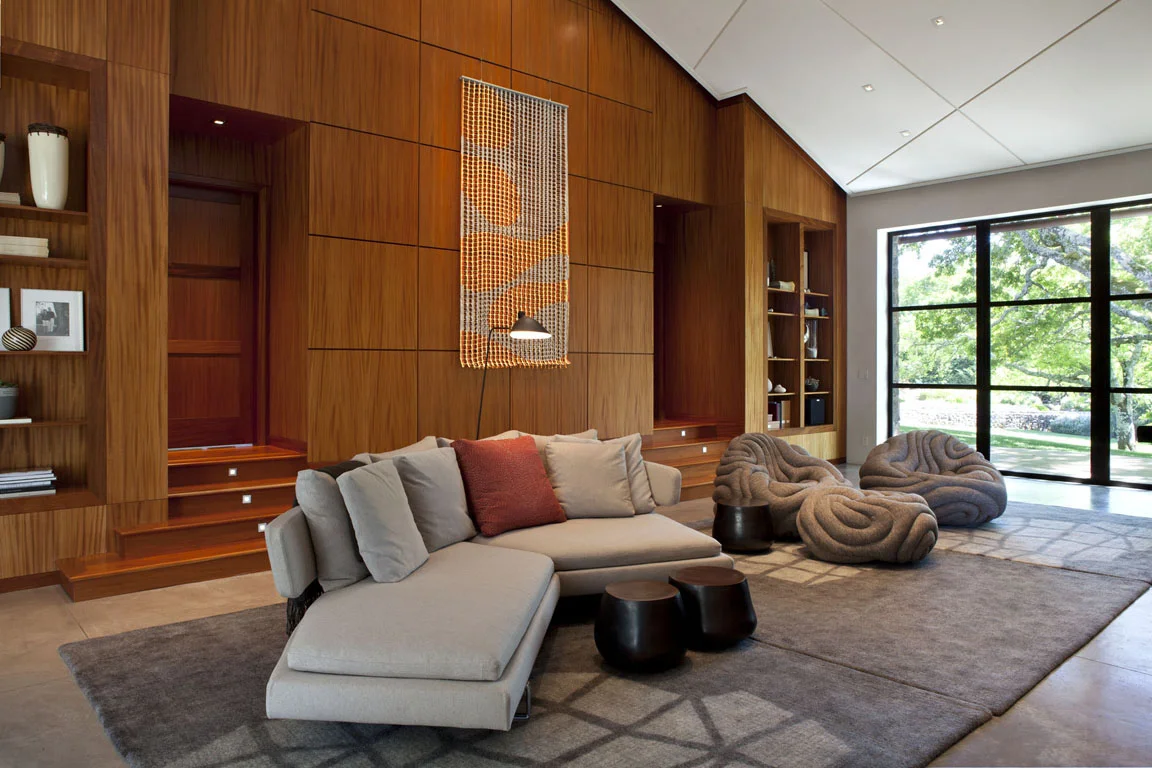
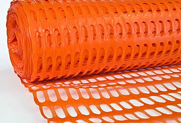
Once the project was completed and ready for photographing, the homeowner realized she did not have artwork for the large wall yet. So to temporarily fill the space she created the large modern wall art piece out of construction netting, typically seen at constructions sites as warning fences. This stuff:

Can you believe it? Genius right?


It's so easy to assume the art was a very expensive piece, cost wise, but it turns out it is a priceless piece and one of a kind too!

An Architect's Master Bath Design

Here in San Francisco space is at a premium, so making the most of the square footage in your home is essential. Many homes have that hard to use, slanted ceiling closet that is just not where you want to start every morning when it's time to get dressed. Gregg, our Principal Architect, had just that space. He's been envisioning transforming this small closet into his dream master bath. His project finally made the job list.


First things first, in order to square off the ceiling for more usable space, the ceiling/roof had to be punched through, creating a dormer. Once approved, demo began and it was time to design the look and feel of the space.


The ocean and the beach have always resonated with Gregg so when a friend gave him these photos, he knew they would be his design inspiration. With a beautiful, timeless, yet masculine color palette, the search for finishes began.

A matte glass mosaic tile from Artistic Tile - The Tozen Collection in Silk Oxygen with gorgeous blues and browns was selected to cover a full wall in the shower. This is the first thing you see upon entering. To make the small space feel larger, a large format tile from Country Floors - Ecocem Porcelain Collection in Melted Ice with a honed finish was used for the other shower walls and the floor. A watery blue grey paint, sophisticated enough for a master bath finished the other walls. Dunn Edwards - Color: Lake Placid.


A floating vanity with a white counter top and a dark wood base also help to make a small space feel larger and airy. Bringing in a wood element adds warmth to a bathroom full of hard surfaces and can also connect an updated space to the roots of a traditional home. Vanity finishes include Caesarstone solid surface in Torquay and Aspen Oak Wood laminate from E.B. Bradley. Designed in-house and built by Kenwood Cabinetry in San Francisco.  We cannot say enough wonderful things about Ken Fong and his work. Thank you!

Another key design element in any space is lighting. Gregg did not skimp here. The vanity lighting is flush and inlaid for an ultra clean look. Under cabinet lighting for the vanity provides a soothing ambience at night. Overall recessed lighting in the space and shower is dimmable and all are on their own switches for efficiency.


With every bathroom design we create at DM+A, the toilet, as nice as it may be, must not be the focal point. With this small space we tucked it behind the vanity.


Not only does Gregg love his new bath, his feline love, Jakers, can often be found lounging on the luxurious radiant heat floors. Cheers to a job well done and long overdue!


Boo-tacular Spaces

What better way to get into the Halloween spirit at work today than by sharing some super fab ways to design with black and orange.

This modern home gets a major boost of curb appeal by going all, and I mean, all black - trim,  and doors for the ultimate wow factor.

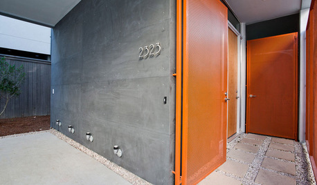
These vibrant orange doors add warmth and a playful air to this Contemporary home.

This room screams fun and best of all, since the overall room is simply black and white, the decor can easily become whatever your heart desires by swapping out art and furnishings.

Designing with these vibrant colors really makes a bold statement, and we love color at DM+A. Contact us if your looking to freshen up your interior.

Take it outside

Jackson_016It’s no secret that the view of San Francisco’s skyline is one of the many benefits of living or working in the city. Unfortunately, it’s not always easy to take in the view by simply drawing back the curtains and looking out a window. The close proximity of neighboring homes and offices often results in a look at nearby architecture, but not much opportunity for the kind of relaxing outdoor living afforded to those residing in the suburbs. This closeness can also make it difficult to get the proper permits for the new construction of a traditional balcony. One way to make the most of your existing space while opening up your home or office to the world outside is with a roof deck.

Jackson_018A roof deck is precisely what it sounds like — a patio-like outdoor area built upon the roof of a structure. They can be designed to include gardens, dining areas, hot tubs and pretty much anything else you might find in a traditional outdoor space. But while simple in concept, proper roof decks require careful design and permits of their own.

The San Francisco Planning Department website offers a glimpse into what is necessary when even considering a new roof deck. In short, due to zoning restrictions, the application may involve several pre-application steps, and even notification of your intentions to some or all of your neighbors.Jackson_017

There are a number of things to consider before a roof deck permit can be approved, including the proposed height and appearance of the deck, its potential environmental impact, the historical significance of the existing building, and the concerns of your neighbors. Basically, San Francisco wants to make sure your relaxing outdoor area is safe, non-invasive and attractive, and you want to ensure your new roof deck contributes to both your comfort and the property’s long-term value.

Lucky for you, De Meza + Architecture is well-versed in roof deck design. We know what the Planning Department is looking for, we know how to maneuver through the red tape, and we know how to maximize the space to ensure you get the roof deck your neighbors will envy.

Tell us what kind of roof deck you’re looking for, and we’ll show you a new way to enjoy San Francisco’s skyline.

Modern design just isn’t what it used to be.

Contemporary DesignOne word many people use to describe the overall feel of their ideal design is “modern,” especially when the design is meant to update an older space. What they typically mean is they want the style and characteristics of their new space to be current and recent. They want something contemporary. “Modern” is a funny word when used as an identifier of style. Historically speaking, modern describes the span of time around the years 1500 to 1800. But kitchen and bathroom fixtures from that time period haven’t yet come back into vogue, and their electrical and lighting designs really wouldn’t meet current building codes.

In the design world, modern describes a specific style movement that was considered “contemporary” from the 1920s through the 1950s. Carefully selected elements from the modern era, as well as those from various other design periods, are often brought together cohesively by present-day designers.

By those same design world definitions, contemporary describes the time period between the 1980s and now, whenever “now” happens to be. If represented on a timeline, it’s typically preferred that contemporary design sits a little closer to the now side than the one bookended by Reagan’s move into the White House. Technically speaking, unless there is a mass shift by the design community at large to either go back in time or far ahead into our estimated future, contemporary design, by its very definition, will be “modern” as long as there is a now for which it to refer.

It’s all complicated stuff.

Luckily, the DM+A team keeps itself up to date on current and emerging trends in architecture and design. We study and research current popular designs, and we know what’s needed in order for those designs to meet strict building codes. We’re watching the trendsetters, but our work is accessible enough to set trends of our own. We know hip and with it and chic and sophisticated and cool. In short, DM+A knows contemporary.

But we also know modern.

“What are these? Houses for ants?”

IMG_0797IMG_0731Yes, actually, if not eaten soon, those tiny buildings may indeed house ants. Today, however, they’re occupied by marshmallow snowmen, gummy bears and various other sticky sweets with which the youngsters chose to adorn their creations during this year’s annual Gingerbread House Decorating Party at Edgewood Center for Children & Families. All year long, we’re the creators. Guided by our clients’ specific needs and desires, we help transform their projects into beautiful and unique commercial or residential spaces. We’re great at what we do and we’re thankful so many people continually place their trust in our architecture and design services. But once a year, we look forward to throwing the building codes out the window and handing complete creative control over to the children of Edgewood.
We supply the basic gingerbread structures, the candy-coated chocolate building blocks and the adhesive sugar icing. The children supply the design skills and all the labor.

Wasting no time with meticulous measuring, and with very little regard for structural integrity, the children got to work this year renovating their plain gingerbread houses into edible works of art. We got to enjoy the creative process as spectators, our roles relegated to little more than replenishing the supplies of candy canes and gumdrops that were used as wall beams and multicolored roof tiles.

Though we had no expectations until that final peppermint candy was iced into place, this party is an old tradition for us, and one that everyone involved looks forward to every holiday season.

More than twenty years ago, the first Gingerbread House Decorating Party took place at Edgewood, a center here in San Francisco that serves children and families who have experienced traumatic stress leading to learning disabilities, mental illness and debilitating behavioral issues. Since 2008, our own Gregg De Meza has spearheaded the annual party, aided by a crew of helpers made up of DM+A’s staff, family and friends.

This party is more than just an afternoon of smiles, laughter and the inevitable sugar high. It’s about appreciation for opportunities — the opportunities Edgewood helps to afford to their children and families, and the opportunity we’ve been afforded to do what we love every day here at DM+A.

And, already, we’re looking forward to the opportunity to do it all again next year.

Color Matters

Dec showcase 1 Dec showcase 2 Color matters in design. When designing with color, always consider the psychology of color, as color can impact mood, lighting and the overall success of a space.
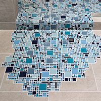
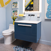
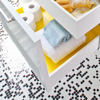
Here at DM+A, we love injecting a youthful vibe into a space by using a hint of yellow. With all of it's positive attributes and the right dosage, we can create fun and memorable spaces.

For tips on using yellow as an accent color in your home, check out 10 Ways to Use Yellow in Your Home Decor.

Cristina, thanks for brightening our day with a feature in your latest article on Martha Stewart.


SFDS 2015 - It's a Wrap, Thanks to All!

tile spilloutvanitySo concludes the 2015 San Francisco Decorator Showcase House. We had a great time designing and executing a wonderful little space for a lucky young guy. Much thanks and gratitude to the homeowners, the staff at University High School, Jenny Bitner, and Thelma Garza. The event could not happen without you all!

Thanks to our construction team at Cook Construction; Greg Cook, Maija Markula and Jesse Beyer for putting our space together.

For our well lit space, many thanks to Lighting Designer Claudio Ramos of Banks Ramos and his team Linda Cooper of Lighting Systems and Tim O’Keefe of Luminii.

For our finishes and materials, big hugs to Helena Jausas of Spec Ceramics who outright donated the  large format tile. A big shout out to Steven Stolman at Kohler for donating all of the plumbing fixtures, and to Jonathan Graves and Shonda Dawson of Dal Tile for their help with the glass mosaic tile.

For the showstoppers, the bathroom wouldn’t have been possible without the generous help from Sozo Studios’ Cynthia Miyashita, Josie Biteng and Allyssa Kucera who designed and fabricated the gorgeous vanity for us.  Alex Blair and Joseph Radovilsky, owners of J&A Stone and Tile for helping us make a splash with their tile installation. And of course to the guys (gals) at DM+A: Rachel Malchow, Lisa Woo, Lannette Guerra and Danielle Johnson, without whose tireless efforts the project wouldn’t have happened.

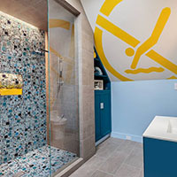
Last, but surely not least, let's give thanks for the art. Thanks to local SF street artist Jeremy Novy for his awesome installation of the 'No Diving' symbol, and to Lisa Chadwick and Melissa Ross with Dolby Chadwick Gallery for loaning us the lovely artwork.

Thank you all!!!!!

Red Carpet SF - 2015 San Francisco Decorator Showcase

05_78C38 D, e, c, o, r, a, t, o, r, S, h, o, w, c, a, s, eThank you Red Carpet Bay Area for the mention! I had to share this great photo of our fearless leader, Gregg De Meza, taken by Drew Altizer Photography in the bathroom we designed for this year's San Francisco Decorator Showcase.

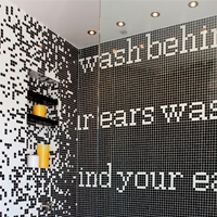
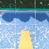
Karter's Bath is for a 9-year old boy. The family loves modern art, so we turned to David Hockney’s Swimming Pool with Reflection for inspiration. We wanted to bring the energy of this piece to life in color, texture and light and we are so pleased with the results.

Please stop by for a peek before the showcase house closes on Memorial day, Monday May 25th.


San Francisco Decorator Showcase - Bathroom Fetish

lips bath by rob j photos Image by Rob J PhotosWell, we all did it! Opening night at the 2015 San Francisco Decorator Showcase House was a night to remember. Congrats to our fellow designers, your rooms are inspiring and oh so cool! On trend this year are textured and patterned wallpapers, high gloss reflective ceilings and draperies with gorgeous adornments. Many of the spaces take on a very masculine or feminine feel.

Since we designed Karter's Bathroom this year, this post is dedicated to the bathrooms in the house. These rooms go beyond utilitarian; they're space to brighten your day, to soak in, literally and to refresh your soul.

Karter's Bathroom, for the families young, sophisticated son, was inspired by the David Hockney piece "Swimming Pool with Reflection". The over scale "No Diving" wall/ceiling art, installed by San Francisco Graffiti Artist Jeremy Novy is a playful nod to the swimming pool diving board and the modern art piece Atmosphere River V, 2015 by Artist, Hunt Rettig in synthetic rubber and acrylics encapsulated in a polyester film, read as sunlit water in the pool. Big thanks to Lisa Chadwick and Melanie Ross at Dolby Chadwick Gallery for providing the artwork in our space this year.

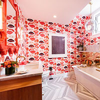
For the families daughter, Nest Design created the ultra feminine, Lips Bathroom. The vanity sconce light fixtures are a must see! Thank you Rob J Photos for the images.

Two other spaces with feminine appeal is the ultra glam En Vogue Salon designed by the fabulous Tineke Triggs of Artistic Designs for Living. Every detail in this space was accounted for, from the mesh fabric used as window sheers to the ceiling treatment. I want to live in this space! Julie Rootes designed the beautiful Powder Room full of glitz and glamour. That tile, that sink, that wallpaper, need I say more!

There are so many more amazing spaces to mention, but so little time. Please visit the showcase house and see for yourself, but if you don't have the chance, SF Curbed showcases the house in all it's glory, thanks to the amazing photography by Patricia Chang Photography. Check out the house here.


Demo Done. Hard Hat Party On!

usfhs logo damien hirst artBeing a part of the San Francisco Decorator Showcase is not all work, and no play. With demolition complete, our California Cool Bath project is moving along as planned. So with work in order, we will play. The Decorator Showcase House is in demo mode, so why not have a party? That's exactly what happened. Last week we attended the 1st of many parties for the showcase house - The Hard Hat party. A time to appreciate the beautiful 9,700 sq ft home designed by Architect Julia Morgan and to catch up and connect with fellow designers and vendors.

Connecting we did. It was so awesome chatting with Alexandra Ray of Five Senses Art, about that perfect piece of art for our showcase room. Thanks for sending your ideas, Alex! Love the idea of a skateboard for a young boy's space - Spin Yellow, 2009 by Damien Hirst is super cool.

Also a big thanks to Thelma Garza, Director of Events and Special Projects at San Francisco University High School for keeping us in the loop and making things happen!

Looking forward to the April 25th Opening Party to be blown away by all of the creativity and sheer gumption from the many top designers of this years showcase house.