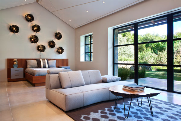
 One word many people use to describe the overall feel of their ideal design is “modern,” especially when the design is meant to update an older space. What they typically mean is they want the style and characteristics of their new space to be current and recent. They want something contemporary.
“Modern” is a funny word when used as an identifier of style. Historically speaking, modern describes the span of time around the years 1500 to 1800. But kitchen and bathroom fixtures from that time period haven’t yet come back into vogue, and their electrical and lighting designs really wouldn’t meet current building codes.
In the design world, modern describes a specific style movement that was considered “contemporary” from the 1920s through the 1950s. Carefully selected elements from the modern era, as well as those from various other design periods, are often brought together cohesively by present-day designers.
By those same design world definitions, contemporary describes the time period between the 1980s and now, whenever “now” happens to be. If represented on a timeline, it’s typically preferred that contemporary design sits a little closer to the now side than the one bookended by Reagan’s move into the White House. Technically speaking, unless there is a mass shift by the design community at large to either go back in time or far ahead into our estimated future, contemporary design, by its very definition, will be “modern” as long as there is a now for which it to refer.
It’s all complicated stuff.
Luckily, the DM+A team keeps itself up to date on current and emerging trends in architecture and design. We study and research current popular designs, and we know what’s needed in order for those designs to meet strict building codes. We’re watching the trendsetters, but our work is accessible enough to set trends of our own. We know hip and with it and chic and sophisticated and cool. In short, DM+A knows contemporary.
But we also know modern.

 So concludes the 2015
 Just wanted to give a shout out to