DMA

SFDS 2015 - It's a Wrap, Thanks to All!

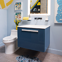
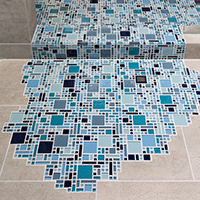
tile spilloutvanitySo concludes the 2015 San Francisco Decorator Showcase House. We had a great time designing and executing a wonderful little space for a lucky young guy. Much thanks and gratitude to the homeowners, the staff at University High School, Jenny Bitner, and Thelma Garza. The event could not happen without you all!

Thanks to our construction team at Cook Construction; Greg Cook, Maija Markula and Jesse Beyer for putting our space together.

For our well lit space, many thanks to Lighting Designer Claudio Ramos of Banks Ramos and his team Linda Cooper of Lighting Systems and Tim O’Keefe of Luminii.

For our finishes and materials, big hugs to Helena Jausas of Spec Ceramics who outright donated the  large format tile. A big shout out to Steven Stolman at Kohler for donating all of the plumbing fixtures, and to Jonathan Graves and Shonda Dawson of Dal Tile for their help with the glass mosaic tile.

For the showstoppers, the bathroom wouldn’t have been possible without the generous help from Sozo Studios’ Cynthia Miyashita, Josie Biteng and Allyssa Kucera who designed and fabricated the gorgeous vanity for us.  Alex Blair and Joseph Radovilsky, owners of J&A Stone and Tile for helping us make a splash with their tile installation. And of course to the guys (gals) at DM+A: Rachel Malchow, Lisa Woo, Lannette Guerra and Danielle Johnson, without whose tireless efforts the project wouldn’t have happened.

Last, but surely not least, let's give thanks for the art. Thanks to local SF street artist Jeremy Novy for his awesome installation of the 'No Diving' symbol, and to Lisa Chadwick and Melissa Ross with Dolby Chadwick Gallery for loaning us the lovely artwork.

Thank you all!!!!!

The Start of a Quinquennial?

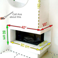
hockney poolpromoted-media-optimized_54d521943f939We're so excited to be one of the few design firms selected in this year's San Francisco Decorators Showcase home. This year we're creating a California cool bath for the couples' young son, inspired by David Hockney's 1978 art piece "Swimming Pool with Reflection". So why a quinquennial? Five years ago we paired up with Helena Jausas at Spec Ceramics, here in San Francisco, for the 2010 Decorator Showcase to create one of DM+A's most published bathrooms. Once again, Helena has donated tile that has the look and feel of a swimming pool deck, On Square in Cemento by Emil Ceramica. Giant hugs and kisses to her for helping us realize our design on this very tight budget.

Looking forward to collaborating on another fabulous project and continuing what looks to be a 5-year tradition!


Elevated Views

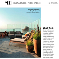
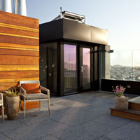
logo page12Thank you Coastal Living magazine for the write up in the July/Aug issue. The Jackson St. roof deck project in San Francisco provided an additional 1,000 sq. ft. of living space; perfect for entertaining high in the sky.

Glass panels were the optimal choice for unobstructed views of the Golden Gate Bridge and the beautiful bay while also providing much needed wind protection. Durable and low maintenance finishes are a necessity for outdoor spaces. Ipe wood juxtaposed with lava stone tiles provide texture and warmth to this modern space.

Here at DM+A, we are all about the animals. We all have pets we consider family members, so another another must consideration when designing with glass panels is for the birds. Gizmag shows a cool example of bird-protection glass and what humans see vs. what birds see.

Let us know if you have a rooftop area that you're interested in developing into a useable space and we can do a feasibility study for you.

Enjoy the summer!


HGTV + Showcase House = Good Times

jonathan rachman entry HGTV Party at 2014 San Francisco Decorator Showcase House

We've been having so much fun at all of the industry events this year and recently attended the HGTV party at the 2014 San Francisco Decorator Showcase. The annual Decorator Showcase benefits San Francisco University High School's Financial Aid program. The Pacific Heights mansion showcased work from the Bay Area's top interior and landscaping design firms.

This year we noticed the overall trend was the use of gold starting at the entry/foyer, designed by Jonathan Rachman. Loved, loved, loved the cowhide rug with the gold splatter in true Jackson Pollack style. We moved on to the dining room where I had to take a closer at the matte gold flatware (so cool), yep, my curiosity caught the attention of everyone in the room including the designer, George Brazil of Sagrera-Brazil Design because, of course, the flatware was attached to the table!

Moving on, I have to give a shout out to HGTV and Hannah Shipley. You are the hosts with the most! As you all know, we DM+Aers are indulgent when it comes to food + drink. Our glasses were never empty and the blue cheese cheesecake bites were so heavenly. I must have the recipe, so if anyone has it, please post! Onward to the next event.

This App Really Measures Up!

MyMeasuresPro copy screen568x568Do you use a tape measure on a daily basis? Are you a homeowner working with an architect, designer or contractor on a project? Are you purchasing new furniture and space planning a room? If so, this is an excellent time and money saving tool for documenting dimensions without having to dip into the budget to hire someone to handle. While field verifying or completing as-built drawings, one of our main tools for the job is the My Measures App. This tool for storing and sharing object dimensions will take the guessing game out of those quick, rough, sketches or lack thereof. Here at DM+A, multiple team members work on the same job, so anyone can understand the dimensioned images and run with them. Simply take a picture, take a physical measurement and add the dimension to the image. Easily calculate area and volume, save it for review later or share it via email or text. This quick My Measures How to Video will demonstrate just how easy this app is to use.

Hooray for My Measures App!


To Render or Not?

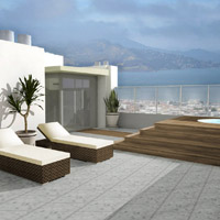
Jackson_015Furnished Roof Deck - View_Rendered2When working with a designer it may be helpful to have a rendered model of the proposed space. Here is an example of a rendering for our client's roof top deck and the final project. In this rendered model, the client wanted to better understand the relationship of the volume within the space along with a few of the finishes. Renderings and models are excellent ways to communicate the design intent. They can be very basic to show volume or get super detailed to give a more realistic image, it's up to you as the client to decide how much time and money it is worth.

For more information on this amazing San Francisco project check out the Jackson St. Penthouse.

Product Love - Bolon

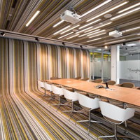
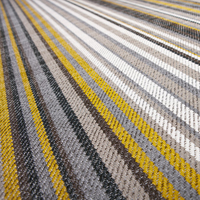
1317131144-jm-fraunhofer-117-528x357 botanic_lotus1We love Bolon, a vinyl product made from renewable raw materials, for it's look and durability. This product is available as a sheet good and most recently as triangular tiles. Here at the DM+A office, we use the exact collection pictured here - Bolon's Botanic collection in Lotus, in our conference room as an area rug. Pedra Silva Architects blanketed the walls, floors and ceilings with the product creating continuity and flow throughout the conference room of the Fraunhofer office in Porto, Portugal. So cool! The product is so durable that Airstream Travel Trailers offer Bolon as a high-end flooring option in their International Sterling edition - way to upgrade any camping experience.

For more information on this amazing product, contact our local San Francisco representative Sayo Seelenbacher of The Patton Group!


Ok, we're just gonna ask - please nominate us!

Room Reveal Design Awards demezaarchitectureWe're so proud of our work, here at DM+A and Room Reveal is having The Spring 2013 Reveal Awards to recognize distinguished residential and commercial design professionals. It's super simple and we would be oh so pleased if you'd hit the nominate button on our profile at Room Reveal. Deadline is May 10th! Many Thanks!

The DM+A Team


Why You Need a Design Professional Before Signing a Commercial Lease in San Francisco

Essential Tips: Steps to take before leasing a commercial space that needs to be remodeled.

Your small business loan just came through, your business needs to expand into its own space, and you are excited to sign the lease and start the remodeling…STOP right there…it would be wise to consider doing the following steps:

  • Is the existing building use correct for your needs?

This might seem like a weird question, but the space which you wish to lease may currently have the use of a warehouse and you are hoping to use it as a large office space.  If the code treats these types of spaces differently, then you will be required get a Change of Use permit.  You are not guaranteed this, so this should be a consideration before signing a lease.  You will need to confirm with the City Planning office to see what the current building use is.

  • Do a walk through with the Landlord and an architect.

Determine if anything needs to be repaired or replaced.  If so, have it all completed before you move in. If there is a tenant improvement allowance as a part of the lease, have an architect assist you to determine if the allowance is enough.  If the landlord will not repair something and you do not intend on fixing it, then take photos to document the existing conditions, so you won’t have to pay for it once you leave.

  • Will your aesthetic needs and expectations be met?

Consult a designer to see if the space can meet your aesthetic end goals. You may really like this bright and open space when you are visiting a listing and want to keep it that way, but the problem is that your program requirement is all private offices and this once open space will be closed up.

  • Was the current space completed with legal permits?

If you plan on doing any work, confirm that any previous work was completed with a building permit.  This may seem like something that is a given, but many people do remodeling without permits to save money.  This will unfortunately cost you more with the addition of adding headaches to the mix.  If you are doing a remodel job and go for permit, the city must have record of the existing conditions.  So if the tenant before you did some illegal work and you plan on retaining that work you’ll have to add it to your plans as new.  This way the city can approve it and it be deemed legal.

Sounds not that bad, huh? Well when you pay your permitting fees or try for unreasonable hardship, they are calculated by the estimated construction cost.  This means, that even if you didn’t actually complete the non-permitted work, you’ll have to include it in the overall construction costs, which will increase your fees or possibly limit the chance to get the hardship approved.

Also what if the work completed was not up to building code?  Well you can imagine the problems could become really big, if say only (1) toilet room was built when (2) are required by code. Would you know this when you walk the space?  Ask the landlord for a copy of the approved drawings.  This will let you walk the space to see if anything was added illegally.  Or go to the building department records to see what is on file and approved.  If you aren’t able to do any of these, then at a minimum protect yourself and add a clause in your leasing contract.  Add a clause which allows you to break the lease should any issues arise from illegal remodeling or have the landlord responsible to remedy the space to be legal and code compliant.

  • Does the exiting work with your intended use & occupancy?

An architect can do quick calculations and analysis to determine what your final occupant load will roughly be, which will tell you how many exits are required.  This gets particularly questionable, when you only have (1) exit to the public way such as the front entrance.  This will limit how many occupants you are allowed to have, which may not be enough to meet your business’s needs.

  • Will your existing furniture & program work?

You should always get a test fit of your program into the proposed space.  It might meet your square footage needs, but are they where you need them?  Furniture needs clearance and you probably want it to be laid out in a comfortable way.  A designer can quickly assess the proposed area and compare with your expectations.

If you're in the Bay Area, please contact us for a free consultation and a walk-through of the potential space.

The DM+A Team
 

Hey, Thanks!

The Thankful DM+A TeamDM+A Thanksgiving Lunch PlateWe celebrated our 4th Annual Thanksgiving Potluck on November 21st this year in typical DM+A style. The menu included Michelle’s Pumpkin Curry Soup and Brussels Spouts, Lisa’s Turkey Breast Roulade, Eduardo’s Roasted Lamb, Rachel’s Beanie-Weenies (don’t ask) and Pumpkin Pie, Colton’s Mashed Potatoes and Gravy, Gregg’s Sausage Stuffing and Sweet Potatoes, and my Cranberry Relish. As you can imagine, our afternoon was spent complaining about full tummies and fighting off the effects to tryptophan.

We are all incredibly grateful that everyone is in good health, that DM+A is still here and that we’ve got many, many friends who are on this crazy journey with us.   Thanks!

I’m Dreaming of a Ginger Xmas

Well, once again the Holiday Season has descended upon us, inciting most of us to scurry about trying to find perfect gifts and throw fabulous holiday soirees. In the middle of all of this, the elves at DM+A begin to prepare for our annual Gingerbread House Decorating Party for the kids at Edgewood Center for Families and Children. Since 2008, we have looked forward to this holiday tradition as a way to give back and to make the holidays special for kids who aren’t as lucky as most. Edgewood Center for Children and Families is a San Francisco institution dating back to Gold Rush days, providing a home, emotional care and support for more than 5,000 children who are victims of abuse, neglect and mental illness.   This year’s statistics:  40 Gingerbread Houses from Reisterer's Bakery, aprons donated by David Myers at Myers & Co., a 50% discount of pizza from Papa John’s,  50 pounds of candy donated by our 15 volunteers made the party for 22 Edgewood kids and 15 counselors another success.  To learn more about Edgewood and how you can get involved, visit their website at www.edgewood.org.

Commandment #11: Love Thy Neighborhood Association

One of the things that I love about San Francisco is that it is more a collection of neighborhoods than one big city. We locals take a keen interest in keeping the character of each neighborhood unique. In most neighborhoods, there are associations staffed by volunteers who work hard to insure the character is maintained.  They are involved in decisions from the kinds of shops, restaurants and other establishments located in the area to the size, design and any modification of the community’s buildings and homes. One of the services we offer our clients is assistance in working with the Neighborhood Associations and the SF Planning department to gain approval for remodels, additions and the new construction of new homes.  An important consideration for our design solutions is to ensure that the aesthetic we propose shows respect for the surrounding locale and a straightforward approach to executing the design.  For us at DM+A that change is usually a project.

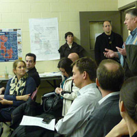
Through our experience, we’ve learned that the most successful projects cover the following bases:  1) the design team meets with the SF Planning department to review the proposed project scope and impact to the surrounding dwellings.; 2) encourage our clients to attend this meeting to hear firsthand the City’s issues and feedback.; 3) advise our clients to meet the neighbors and introduce themselves to the Neighborhood Association members prior to any plans or documents be filed with the city; 4) host an informal gathering to these folks to show concepts and initial design sketches and respond to any questions or concerns about the project.

Involving the client’s neighbors in the beginning of the design process allows us to address any pressing concerns or requirements; shows respect for the community and can make the permitting process more successful.  As with many things in life, a little open dialogue goes a long way.

Frankie, Come Back

The DM+A team and our friend Scott are worried sick about one of our office pets, Frankie the Chihuahua.  Frankie, who is also Lollie’s boyfriend of 6 years, was taken from Scott’s front porch in the Mission at Treat and 25th on Saturday, January 7th. We miss him terribly and are all hoping that Frankie will be returned soon.  Scott has filed a lost dog report with the ACC (Animal Care and Control), papered the area with Frankie’s picture and description and he is scouring the internet to see if a dog of Frankie’s description pops up there.  See the craigslist posting for more details.

In the meantime please join us in sending out positive thoughts of Frankie bounding through our office doors and doing his morning greeting ritual.  We appreciate all the help we can get.

DIFFA's Dining by Design

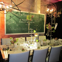
DIFFA's Dining by Design San Franciso Event 2011DIFFA's Dining by Design San Francisco Event 2011 DIFFA’s Dining by Design table hop party was full of inspiring ideas, delicious food and familiar faces from the San Francisco architecture and design community.  Lisa and I attended this year and enjoyed mingling with fellow designers while checking out the creative table designs of this year’s participating designers.

The diversity of designs was truly impressive.  We viewed tables that were dark and moody, traditional and elegant, inspired by nature, and even inspired by a science laboratory!   We loved the tongue-and-cheek use of the Fabio Novembre Him & Her chairs that featured chairs with butts.  The students of CCA designed a table using string radiating from an illuminated hole in the background that reminded us of a solar eclipse.

We even got to chat with the charismatic Mondo Guerra, former Project Runway Season 8 Star, who worked with students from San Francisco State University to design a table inspired by fire.  They came up with an enchanting, dark, not so Mondo design that featured a mostly black color palette with no patterns.  Moooi’s Smoke Dining Chair, which looks like a chair that was previously lit on fire, was perfectly placed in this table design.

Mondo also shared with us his new project, the National HIV Education CampaignLiving Positive by Design, which we hope to volunteer for sometime in the near future.

This was a fabulous event for a great cause.  DIFFA grants proceeds from the event to the Positive Health Program at San Francisco General Hospital, ranked as the nation’s top HIV/AIDS clinic since 1983.

Boarding School

Many a sales rep has crossed the DM+A threshold, but it’s something special when their products get past our “seen it before” sensors.  Yesterday Jeff Sterneberg wowed us with Domusarte I.P.F. wood flooring.  I love it when a product sparks my design-y brain into action and this line had me coming up with design solutions a plenty.  Jeff did a great job of educating us about his product line and showing us some incredible installations done throughout the world. 

What makes this flooring so desirable, besides being from Italy (of, course), is the range of finish options, board sizes and customization possibilities Domusarte offers.   It’s a beautiful, durable and flexible flooring that is perfect for distinctive interiors. 

If you haven’t already seen this line, you can contact Jeff at 415.754.9649 or jsterneberg@gmail.com.

It’s our turn

Gregg and I were recently invited to a networking event at AT &T Park, generously hosted by ALR/ANSR, GFDS Engineers, Studio Becker and Engineered Environments.  After watching  Rachel and Michelle enjoy SF Giant’s ticket gifts this season, it was our turn to partake.  We were treated to a pre-game party at Triples Alley and then to great box seats for the game against the Colorado Rockies.  On one of those rare warm evenings in San Francisco, the weather was perfect for a night game.  It was fun to spend time with many of our friends, including Claudio Ramos (HE Banks), Justin Wright (Engineered Environments), Leslie Siegel (ALR), Dan Pelsinger and Dan Matarozzi (Matarozzi Pelsinger Builders), and Clayton Timbrell (Clayton Timbrell & Company) and seeing so many other familiar faces.  Thanks again to our hosts for including us in such a great event.

Help us help you help them

Hey people, now is your chance to bid on a DM+A consultation AND help a worthy organization continue their important works.  We’re participating in the 2011 ALRP Online Auction by offering  an Architecture and Interior Design consultation for a room of your choice. 

DM+A is proud to support Aids Legal Referral Panel (ALRP) and to join in on the fun of ALRP’s big annual fundraiser.  All proceeds from the auction will go to directly support the group’s mission to provide free or low-cost legal services for people with HIV / AIDS.  You can bid either online until October 17th or live and in person at the Live Auction Reception on October 19th in San Francisco at the War Memorial Building.  So bid, and bid often.

Great Scott!

Scott Idleman Painting - Oblivion II at 2011 SF Open StudiosOur friend, graphic designer and artist Scott Idleman, has been brightening our days for a while now.  A few months ago, he installed some of his fabulous paintings here at DM+A to provide some color to our walls.  Then last month he began renting work space in our office, adding not only his cheerful disposition, but two more dogs to our menagerie.  So we couldn’t be happier to support Scott in his participation of the 2011 SF Open Studios, going on this weekend.  Please go see his work on Saturday (October 1st) and Sunday (October 2nd) between 11am and 6pm at his studio at 1206 Treat Avenue.  If you’re interested in his graphic design work, visit his website, www.blinkdesign.com.
Let’s Get Fulk’d Up!

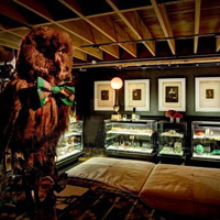
The DM+A team came out in full force to check out Ken Fulk’s Peep ShowKen Fulk created much more than a party for his guests.  Upon entering the party, guests were transported into a provocative, sexy, Vaudevillian world of carnival and mystery.  At the entrance, guests were greeted by two scantily clad dancers, dancing in giant skeleton key peep holes in the front windows.  Party goers could witness things such as stilt walkers, women dancing with snakes, contortionists and actors in costumes getting it on in the middle of the party. 

Ken’s new collection included an unlimited amount of vintage and found objects that are sure to make a statement in any interior.  A favorite of the DM+A crew was a large chandelier made of rusty saw blades. 

Ken Fulk’s Peep Show was an amazing party that demonstrated the creativity and imagination of Mr. Fulk’s design team.  Some are already referring to the evening as the party of the year!