Architect

An Architect's Master Bath Design

Here in San Francisco space is at a premium, so making the most of the square footage in your home is essential. Many homes have that hard to use, slanted ceiling closet that is just not where you want to start every morning when it's time to get dressed. Gregg, our Principal Architect, had just that space. He's been envisioning transforming this small closet into his dream master bath. His project finally made the job list.


First things first, in order to square off the ceiling for more usable space, the ceiling/roof had to be punched through, creating a dormer. Once approved, demo began and it was time to design the look and feel of the space.


The ocean and the beach have always resonated with Gregg so when a friend gave him these photos, he knew they would be his design inspiration. With a beautiful, timeless, yet masculine color palette, the search for finishes began.

A matte glass mosaic tile from Artistic Tile - The Tozen Collection in Silk Oxygen with gorgeous blues and browns was selected to cover a full wall in the shower. This is the first thing you see upon entering. To make the small space feel larger, a large format tile from Country Floors - Ecocem Porcelain Collection in Melted Ice with a honed finish was used for the other shower walls and the floor. A watery blue grey paint, sophisticated enough for a master bath finished the other walls. Dunn Edwards - Color: Lake Placid.


A floating vanity with a white counter top and a dark wood base also help to make a small space feel larger and airy. Bringing in a wood element adds warmth to a bathroom full of hard surfaces and can also connect an updated space to the roots of a traditional home. Vanity finishes include Caesarstone solid surface in Torquay and Aspen Oak Wood laminate from E.B. Bradley. Designed in-house and built by Kenwood Cabinetry in San Francisco.  We cannot say enough wonderful things about Ken Fong and his work. Thank you!

Another key design element in any space is lighting. Gregg did not skimp here. The vanity lighting is flush and inlaid for an ultra clean look. Under cabinet lighting for the vanity provides a soothing ambience at night. Overall recessed lighting in the space and shower is dimmable and all are on their own switches for efficiency.


With every bathroom design we create at DM+A, the toilet, as nice as it may be, must not be the focal point. With this small space we tucked it behind the vanity.


Not only does Gregg love his new bath, his feline love, Jakers, can often be found lounging on the luxurious radiant heat floors. Cheers to a job well done and long overdue!



Demo Done. Hard Hat Party On!

usfhs logo damien hirst artBeing a part of the San Francisco Decorator Showcase is not all work, and no play. With demolition complete, our California Cool Bath project is moving along as planned. So with work in order, we will play. The Decorator Showcase House is in demo mode, so why not have a party? That's exactly what happened. Last week we attended the 1st of many parties for the showcase house - The Hard Hat party. A time to appreciate the beautiful 9,700 sq ft home designed by Architect Julia Morgan and to catch up and connect with fellow designers and vendors.

Connecting we did. It was so awesome chatting with Alexandra Ray of Five Senses Art, about that perfect piece of art for our showcase room. Thanks for sending your ideas, Alex! Love the idea of a skateboard for a young boy's space - Spin Yellow, 2009 by Damien Hirst is super cool.

Also a big thanks to Thelma Garza, Director of Events and Special Projects at San Francisco University High School for keeping us in the loop and making things happen!

Looking forward to the April 25th Opening Party to be blown away by all of the creativity and sheer gumption from the many top designers of this years showcase house.

7 for 7

Architect Registration Examarepact For those of you who follow our blog, you might have seen my post explaining the process of licensure for an architect.  Or the one where I passed Site Planning and Design.  Well those were about 3 years ago and there is a 5 year limit on the exams. So if I didn't pass all of the exams by the 5 year mark, I would have to retake any that were over 5 years old.  If any of you know me, you know that that is not an option for me.  Ideally I would have picked one exam off after another.  But with teaching on the side, rowing, and just wanting to have a life, meant the 5 year limit was approaching and I still had (6) exams to go!

Luckily I came across a program through the AIA San Francisco called the ARE Pact.  It is where you register for the program with a fee of $1,000.  With the enrollment, you are placed within a study group of 10 and you gain access to free ARE lectures and study materials.  If you take all the exams within 1 year you are refunded your $1,000.  I know myself enough that if I was able to round up $1,000 to partake in this program, I would make sure I would get that thousand bucks back!

Well that is what I have been doing this last year.  I didn’t row, cut back on my teaching, and barely had a life!  But with perseverance and determination I did complete all the exams and am happy to report that I passed all of them as well.  I went 7 for 7 and am officially done with the ARE (Architectural Registration Exams)!  Thank you ARE Pact & Michelle Railsback for making this program happen!

But I can’t call myself an architect yet…I still have to take the CSE (California Supplemental Exam)…And the process continues : )

This App Really Measures Up!

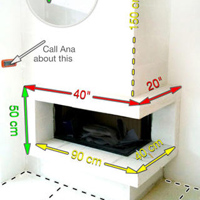
MyMeasuresPro copy screen568x568Do you use a tape measure on a daily basis? Are you a homeowner working with an architect, designer or contractor on a project? Are you purchasing new furniture and space planning a room? If so, this is an excellent time and money saving tool for documenting dimensions without having to dip into the budget to hire someone to handle. While field verifying or completing as-built drawings, one of our main tools for the job is the My Measures App. This tool for storing and sharing object dimensions will take the guessing game out of those quick, rough, sketches or lack thereof. Here at DM+A, multiple team members work on the same job, so anyone can understand the dimensioned images and run with them. Simply take a picture, take a physical measurement and add the dimension to the image. Easily calculate area and volume, save it for review later or share it via email or text. This quick My Measures How to Video will demonstrate just how easy this app is to use.

Hooray for My Measures App!


5 YRS in the Making

Rachel1_resizedBlocks_1_edited5 years ago, I quit my architecture job with no prospects in place.  I knew I needed out.  The job felt more like AutoCAD boot camp than a place where I could grow as a promising architect.  I flew home for a few weeks to be with family and returned ready to take the open architectural positions by storm.  I have always been a go getter and this time I knew I wouldn’t settle for a place which pushed you so hard beyond your capacity, you forget why you even got into this profession.  I knew I wanted to be somewhere that I could learn and enjoy working.  During my search I came across an ad on Craigslist that, I have to say seemed bogus at first, because it was a hiring agency, which I wasn’t used to.  Through my discussions with the agency they explained the open position and the firm De Meza + Architecture.  I interviewed and liked the people I met, plus the firm was expanding and had just moved into a new office and were excited about the possibilities.  This mimicked my own life, as I had just moved to a different neighborhood and wanted my life in the Bay Area to become what I envisioned it could be.  I accepted the position as architectural designer/drafter and was invited to their open house party for their new office.  That was definitely a change to my last job.  A friend and I went and we enjoyed margaritas and tacos on the roof of the office space.  How cool was that! Needless to say, I started work and learned the ropes.  Over the 5 years I have seen co-workers come and go.  I saw changes in clientele and in the office setting. Over that time I grew into a role of managing projects.  I always try to find ways to be more efficient or strategic.  No matter the scale of the project, I always wanted it to be perfect.  One thing I have learned over these years is that being perfect is impossible, and that I will be more focused on doing the best job I can and ask that of anyone I am in charge of.  This has allowed me to become a more rounded designer and manager.  If I was at another firm, I don’t think I could have gained as much experience as I have at DM+A.

The one thing that hasn’t changed is the unique office culture DM+A has to offer.  Where else would the boss take us out for ice cream because a power outage?  Or where we would do pot lucks for lunches or happy hour at the office. Or get to see slideshows of trips anyone went on.  For my 5 year anniversary, Gregg treated us to dinner, drinks and yes, of course dessert at Bix in San Francisco - a must try. There is never a dull moment at DM+A and they have become my family away from home.   This job has introduced me to some of my favorite people to be around.

So what’s in store for the next 5 years?  I will obtain my architectural license, there will probably be some changes of clientele, new projects, experiences…and of course more of the unconventional office culture I have come to cherish while at DM+A.

Cheers!

Happy Belated Birthday Gregg!

donuts at wayfare_200x200 gregg at wayfare tavern_200x200Another year has passed for our fearless Architect, Gregg De Meza and in usual fashion, we celebrated with food and drink. This year we lunched at Tyler Florence's Wayfare Tavern and boy did we feast. For starters, we were feeling devilish, so we of course had to try the much talked about Deviled Eggs with english peas, salt cured ham and truffled pea salt. The yolks were airy and light - whipped into submission as Julie so swiftly commented in the movie Julie and Julia. We also had the Devil's on Horseback - Medjool dates, bacon, blue cheese, shiso hazelnut pesto. A sweet and smokey delight.

Now to the main event, Gregg happily had the tender Butcher's Filet as pictured - yum! Rachel had the Seared Ahi Tuna paired with a Carrot Margarita! How interesting. I strategically enjoyed a classic Dungeness Crab Louie to allow room for the final act - dessert.

Not just any dessert either, but Homemade Donuts, piping hot and served with dipping sauce. Please, please Wayfare Tavern, never part with the Earl Grey sauce, this is a must try. Great way to end a happy birthday luncheon! Until next year, happy eating.

p.s. also worth mentioning, instead of a bread basket, Wayfare Tavern starts with Popovers!


Ok, we're just gonna ask - please nominate us!

Room Reveal Design Awards demezaarchitectureWe're so proud of our work, here at DM+A and Room Reveal is having The Spring 2013 Reveal Awards to recognize distinguished residential and commercial design professionals. It's super simple and we would be oh so pleased if you'd hit the nominate button on our profile at Room Reveal. Deadline is May 10th! Many Thanks!

The DM+A Team


Why You Need a Design Professional Before Signing a Commercial Lease in San Francisco

Essential Tips: Steps to take before leasing a commercial space that needs to be remodeled.

Your small business loan just came through, your business needs to expand into its own space, and you are excited to sign the lease and start the remodeling…STOP right there…it would be wise to consider doing the following steps:

  • Is the existing building use correct for your needs?

This might seem like a weird question, but the space which you wish to lease may currently have the use of a warehouse and you are hoping to use it as a large office space.  If the code treats these types of spaces differently, then you will be required get a Change of Use permit.  You are not guaranteed this, so this should be a consideration before signing a lease.  You will need to confirm with the City Planning office to see what the current building use is.

  • Do a walk through with the Landlord and an architect.

Determine if anything needs to be repaired or replaced.  If so, have it all completed before you move in. If there is a tenant improvement allowance as a part of the lease, have an architect assist you to determine if the allowance is enough.  If the landlord will not repair something and you do not intend on fixing it, then take photos to document the existing conditions, so you won’t have to pay for it once you leave.

  • Will your aesthetic needs and expectations be met?

Consult a designer to see if the space can meet your aesthetic end goals. You may really like this bright and open space when you are visiting a listing and want to keep it that way, but the problem is that your program requirement is all private offices and this once open space will be closed up.

  • Was the current space completed with legal permits?

If you plan on doing any work, confirm that any previous work was completed with a building permit.  This may seem like something that is a given, but many people do remodeling without permits to save money.  This will unfortunately cost you more with the addition of adding headaches to the mix.  If you are doing a remodel job and go for permit, the city must have record of the existing conditions.  So if the tenant before you did some illegal work and you plan on retaining that work you’ll have to add it to your plans as new.  This way the city can approve it and it be deemed legal.

Sounds not that bad, huh? Well when you pay your permitting fees or try for unreasonable hardship, they are calculated by the estimated construction cost.  This means, that even if you didn’t actually complete the non-permitted work, you’ll have to include it in the overall construction costs, which will increase your fees or possibly limit the chance to get the hardship approved.

Also what if the work completed was not up to building code?  Well you can imagine the problems could become really big, if say only (1) toilet room was built when (2) are required by code. Would you know this when you walk the space?  Ask the landlord for a copy of the approved drawings.  This will let you walk the space to see if anything was added illegally.  Or go to the building department records to see what is on file and approved.  If you aren’t able to do any of these, then at a minimum protect yourself and add a clause in your leasing contract.  Add a clause which allows you to break the lease should any issues arise from illegal remodeling or have the landlord responsible to remedy the space to be legal and code compliant.

  • Does the exiting work with your intended use & occupancy?

An architect can do quick calculations and analysis to determine what your final occupant load will roughly be, which will tell you how many exits are required.  This gets particularly questionable, when you only have (1) exit to the public way such as the front entrance.  This will limit how many occupants you are allowed to have, which may not be enough to meet your business’s needs.

  • Will your existing furniture & program work?

You should always get a test fit of your program into the proposed space.  It might meet your square footage needs, but are they where you need them?  Furniture needs clearance and you probably want it to be laid out in a comfortable way.  A designer can quickly assess the proposed area and compare with your expectations.

If you're in the Bay Area, please contact us for a free consultation and a walk-through of the potential space.

The DM+A Team