interior design

Color Matters

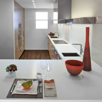
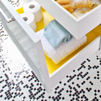
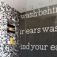
Dec showcase 1 Dec showcase 2 Color matters in design. When designing with color, always consider the psychology of color, as color can impact mood, lighting and the overall success of a space.

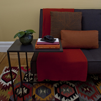
Here at DM+A, we love injecting a youthful vibe into a space by using a hint of yellow. With all of it's positive attributes and the right dosage, we can create fun and memorable spaces.

For tips on using yellow as an accent color in your home, check out 10 Ways to Use Yellow in Your Home Decor.

Cristina, thanks for brightening our day with a feature in your latest article on Martha Stewart.


HGTV + Showcase House = Good Times

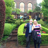
jonathan rachman entry HGTV Party at 2014 San Francisco Decorator Showcase House

We've been having so much fun at all of the industry events this year and recently attended the HGTV party at the 2014 San Francisco Decorator Showcase. The annual Decorator Showcase benefits San Francisco University High School's Financial Aid program. The Pacific Heights mansion showcased work from the Bay Area's top interior and landscaping design firms.

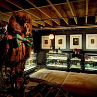
This year we noticed the overall trend was the use of gold starting at the entry/foyer, designed by Jonathan Rachman. Loved, loved, loved the cowhide rug with the gold splatter in true Jackson Pollack style. We moved on to the dining room where I had to take a closer at the matte gold flatware (so cool), yep, my curiosity caught the attention of everyone in the room including the designer, George Brazil of Sagrera-Brazil Design because, of course, the flatware was attached to the table!

Moving on, I have to give a shout out to HGTV and Hannah Shipley. You are the hosts with the most! As you all know, we DM+Aers are indulgent when it comes to food + drink. Our glasses were never empty and the blue cheese cheesecake bites were so heavenly. I must have the recipe, so if anyone has it, please post! Onward to the next event.

Product Love

1000 Containers,1 sheet of 100 percent3forms 100 percentWe love 3form's 100 percent - an architectural resin panel. Each panel contains more than 1,000 bottles; an excellent way projects can earn up to 2 LEED credits for recycled content, how cool is that? We can't wait to use it on our next project. The panels are available in 2 pattern directions: latitude or longitude. What's your preference?

Check out their site for more details: http://www.3-form.com/materials/100_percent/


Ok, we're just gonna ask - please nominate us!

Room Reveal Design Awards demezaarchitectureWe're so proud of our work, here at DM+A and Room Reveal is having The Spring 2013 Reveal Awards to recognize distinguished residential and commercial design professionals. It's super simple and we would be oh so pleased if you'd hit the nominate button on our profile at Room Reveal. Deadline is May 10th! Many Thanks!

The DM+A Team


Help us help you help them

Hey people, now is your chance to bid on a DM+A consultation AND help a worthy organization continue their important works.  We’re participating in the 2011 ALRP Online Auction by offering  an Architecture and Interior Design consultation for a room of your choice. 

DM+A is proud to support Aids Legal Referral Panel (ALRP) and to join in on the fun of ALRP’s big annual fundraiser.  All proceeds from the auction will go to directly support the group’s mission to provide free or low-cost legal services for people with HIV / AIDS.  You can bid either online until October 17th or live and in person at the Live Auction Reception on October 19th in San Francisco at the War Memorial Building.  So bid, and bid often.

Let’s Get Fulk’d Up!

The DM+A team came out in full force to check out Ken Fulk’s Peep ShowKen Fulk created much more than a party for his guests.  Upon entering the party, guests were transported into a provocative, sexy, Vaudevillian world of carnival and mystery.  At the entrance, guests were greeted by two scantily clad dancers, dancing in giant skeleton key peep holes in the front windows.  Party goers could witness things such as stilt walkers, women dancing with snakes, contortionists and actors in costumes getting it on in the middle of the party. 

Ken’s new collection included an unlimited amount of vintage and found objects that are sure to make a statement in any interior.  A favorite of the DM+A crew was a large chandelier made of rusty saw blades. 

Ken Fulk’s Peep Show was an amazing party that demonstrated the creativity and imagination of Mr. Fulk’s design team.  Some are already referring to the evening as the party of the year!

Saga Swimwear

Saga Swimsuits San FranciscoSaga Swimwear San FranciscoWhen I am not busy at my day job as an interior designer at DM+A, I am a freelance writer for MF Magazine, a music/fashion/entertainment magazine based in Portland, Oregon.  Recently, I interviewed Michelle Byrnes and Alex McCauley, two awesome girls that started San Francisco’s Saga Swimwear.  Check out my article to learn more about Saga and their sophisticated, sexy swimsuit designs! I have been writing for MF Magazine for four years and have covered several musicians, actors and fashion designers.  Read my article in our latest print issue (flip to page eight) on Sweden’s Peter Bjorn and John and their latest album Gimme Some .

AI Teaching - Here's a Lesson For You

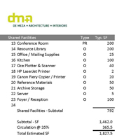
Typically I teach building codes at the Art Institute of California – San Francisco.  Teaching Building Codes is a bit dry, but once a student “gets” it, it’s rewarding.  This quarter I have the opportunity to teach Programming and Space Planning 1 for the Interior Design dept.  It’s really fun exploring the different methods of programming.  In the real world, time is of the essence, so you don’t get to do every method of research.  The programming phase is when we as designer’s research, explore, and investigate the facets of a project.  It is the most important phase, because it can make or break the project.  By programming we define the client’s needs and prioritize the client’s wants.  There isn’t one clear path to programming.  Each job, client, and designer will require different methods. The goal is to be as efficient as possible with our time and make the largest leaps with the information at hand.

Sometimes as a client, you may think, “I can tell you all you need to know.”  But in reality, there are just some things you don’t think about, especially when it’s about the use of space.  As a client, your priorities are different than ours as a designer. You may want the design to be completed cheap and fast, when we want to take the necessary time to design, so the users can work efficiently.  Always remember that the Programming phase isn’t a phase you want to rush.  If something isn’t planned for, it will affect the rest of phases and in the long run take more time.
Fresh Meat

Hey everybody, we’ve pushed some new projects up onto our recently spiffed up website.  We’ve responded to great feedback and made our portfolio section easier to navigate and enlarged the images in this section for better viewing.  New projects include a gut renovation (Daly Mansion), a home office (SF Home Office), and an executive conference room (Oracle CVC).  We’ll have a few new projects to add in the months to come.  Stay tuned.

Future Designers of America

AICA-SF LogoI was recently invited to be a member of the Professional Advisory Committee for the Interior Design Program at The Art Institute of California – San Francisco.  Always ready and willing to offer my two cents on anything design-related, I happily agreed.  This involved participating in a Student Portfolio Review and a discussion about the program’s curriculum.  My fellow committee members included other industry professionals from firms such as BAR Architects, HOK and the Wiseman Group.  It was great to hear what different studios are looking for in junior staff and to observe what other design pros see when looking at the students’ work.  The general consensus was: show more process and basic design practices and focus less on the smoke and mirrors in the presentation.  So, okay kids, listen up.  Here’s a little free advice: Hone your design skills; develop proficiency in drafting conventions; practice your hand sketching; and have a point of view!  If you can’t demonstrate these things, all the overblown graphics in your presentation documents won’t make a bit of difference.  As the incredibly astute Louis Schump of HOK offered, “It’s hard to see what’s going on with the plan when it’s cloaked in a sea of baby’s faces or a bamboo forest”.  So true, Louis.  So true.

Al Crit

Since I teach at the Art Institute of California – San Francisco, I was asked to do a portfolio critique at our office.  Gregg and Jennifer accepted to sit in as well.  Kimberly Pendergast & Jay Patel are in their final quarter of the Interior Design program.  I ended up not saying much because it was enlightening to just listen to Gregg and Jennifer.  Each of them have a different approach when critiquing, but they also complement each other.  Gregg’s approach is from the role of an architect and designer, who wants to see the overall product be of high quality and beautiful.   Jennifer’s approach is from the role of interior designer and her experience in advertising, focused on the details and the professionalism of the portfolio.  Any comment I may have had, they picked up and were spot on.  I was impressed to just how much was accomplished in such a little amount of time and I hope the critique helps Kim and Jay bring their portfolios to their full potential.

You can view AI student portfolio work here.