Recent Posts

Take it outside

Jackson_016It’s no secret that the view of San Francisco’s skyline is one of the many benefits of living or working in the city. Unfortunately, it’s not always easy to take in the view by simply drawing back the curtains and looking out a window. The close proximity of neighboring homes and offices often results in a look at nearby architecture, but not much opportunity for the kind of relaxing outdoor living afforded to those residing in the suburbs. This closeness can also make it difficult to get the proper permits for the new construction of a traditional balcony. One way to make the most of your existing space while opening up your home or office to the world outside is with a roof deck.

Jackson_018A roof deck is precisely what it sounds like — a patio-like outdoor area built upon the roof of a structure. They can be designed to include gardens, dining areas, hot tubs and pretty much anything else you might find in a traditional outdoor space. But while simple in concept, proper roof decks require careful design and permits of their own.

The San Francisco Planning Department website offers a glimpse into what is necessary when even considering a new roof deck. In short, due to zoning restrictions, the application may involve several pre-application steps, and even notification of your intentions to some or all of your neighbors.Jackson_017

There are a number of things to consider before a roof deck permit can be approved, including the proposed height and appearance of the deck, its potential environmental impact, the historical significance of the existing building, and the concerns of your neighbors. Basically, San Francisco wants to make sure your relaxing outdoor area is safe, non-invasive and attractive, and you want to ensure your new roof deck contributes to both your comfort and the property’s long-term value.

Lucky for you, De Meza + Architecture is well-versed in roof deck design. We know what the Planning Department is looking for, we know how to maneuver through the red tape, and we know how to maximize the space to ensure you get the roof deck your neighbors will envy.

Tell us what kind of roof deck you’re looking for, and we’ll show you a new way to enjoy San Francisco’s skyline.

Modern design just isn’t what it used to be.

Contemporary DesignOne word many people use to describe the overall feel of their ideal design is “modern,” especially when the design is meant to update an older space. What they typically mean is they want the style and characteristics of their new space to be current and recent. They want something contemporary. “Modern” is a funny word when used as an identifier of style. Historically speaking, modern describes the span of time around the years 1500 to 1800. But kitchen and bathroom fixtures from that time period haven’t yet come back into vogue, and their electrical and lighting designs really wouldn’t meet current building codes.
In the design world, modern describes a specific style movement that was considered “contemporary” from the 1920s through the 1950s. Carefully selected elements from the modern era, as well as those from various other design periods, are often brought together cohesively by present-day designers.

By those same design world definitions, contemporary describes the time period between the 1980s and now, whenever “now” happens to be. If represented on a timeline, it’s typically preferred that contemporary design sits a little closer to the now side than the one bookended by Reagan’s move into the White House. Technically speaking, unless there is a mass shift by the design community at large to either go back in time or far ahead into our estimated future, contemporary design, by its very definition, will be “modern” as long as there is a now for which it to refer.

It’s all complicated stuff.

Luckily, the DM+A team keeps itself up to date on current and emerging trends in architecture and design. We study and research current popular designs, and we know what’s needed in order for those designs to meet strict building codes. We’re watching the trendsetters, but our work is accessible enough to set trends of our own. We know hip and with it and chic and sophisticated and cool. In short, DM+A knows contemporary.

But we also know modern.

“What are these? Houses for ants?”

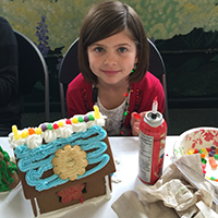
IMG_0797IMG_0731Yes, actually, if not eaten soon, those tiny buildings may indeed house ants. Today, however, they’re occupied by marshmallow snowmen, gummy bears and various other sticky sweets with which the youngsters chose to adorn their creations during this year’s annual Gingerbread House Decorating Party at Edgewood Center for Children & Families. All year long, we’re the creators. Guided by our clients’ specific needs and desires, we help transform their projects into beautiful and unique commercial or residential spaces. We’re great at what we do and we’re thankful so many people continually place their trust in our architecture and design services. But once a year, we look forward to throwing the building codes out the window and handing complete creative control over to the children of Edgewood.
We supply the basic gingerbread structures, the candy-coated chocolate building blocks and the adhesive sugar icing. The children supply the design skills and all the labor.

Wasting no time with meticulous measuring, and with very little regard for structural integrity, the children got to work this year renovating their plain gingerbread houses into edible works of art. We got to enjoy the creative process as spectators, our roles relegated to little more than replenishing the supplies of candy canes and gumdrops that were used as wall beams and multicolored roof tiles.

Though we had no expectations until that final peppermint candy was iced into place, this party is an old tradition for us, and one that everyone involved looks forward to every holiday season.

More than twenty years ago, the first Gingerbread House Decorating Party took place at Edgewood, a center here in San Francisco that serves children and families who have experienced traumatic stress leading to learning disabilities, mental illness and debilitating behavioral issues. Since 2008, our own Gregg De Meza has spearheaded the annual party, aided by a crew of helpers made up of DM+A’s staff, family and friends.

This party is more than just an afternoon of smiles, laughter and the inevitable sugar high. It’s about appreciation for opportunities — the opportunities Edgewood helps to afford to their children and families, and the opportunity we’ve been afforded to do what we love every day here at DM+A.

And, already, we’re looking forward to the opportunity to do it all again next year.

Color Matters

Dec showcase 1 Dec showcase 2 Color matters in design. When designing with color, always consider the psychology of color, as color can impact mood, lighting and the overall success of a space.
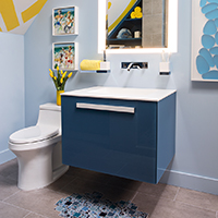
Here at DM+A, we love injecting a youthful vibe into a space by using a hint of yellow. With all of it's positive attributes and the right dosage, we can create fun and memorable spaces.

For tips on using yellow as an accent color in your home, check out 10 Ways to Use Yellow in Your Home Decor.

Cristina, thanks for brightening our day with a feature in your latest article on Martha Stewart.


SFDS 2015 - It's a Wrap, Thanks to All!

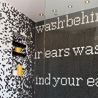
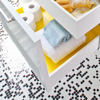
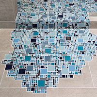
tile spilloutvanitySo concludes the 2015 San Francisco Decorator Showcase House. We had a great time designing and executing a wonderful little space for a lucky young guy. Much thanks and gratitude to the homeowners, the staff at University High School, Jenny Bitner, and Thelma Garza. The event could not happen without you all!

Thanks to our construction team at Cook Construction; Greg Cook, Maija Markula and Jesse Beyer for putting our space together.

For our well lit space, many thanks to Lighting Designer Claudio Ramos of Banks Ramos and his team Linda Cooper of Lighting Systems and Tim O’Keefe of Luminii.

For our finishes and materials, big hugs to Helena Jausas of Spec Ceramics who outright donated the  large format tile. A big shout out to Steven Stolman at Kohler for donating all of the plumbing fixtures, and to Jonathan Graves and Shonda Dawson of Dal Tile for their help with the glass mosaic tile.

For the showstoppers, the bathroom wouldn’t have been possible without the generous help from Sozo Studios’ Cynthia Miyashita, Josie Biteng and Allyssa Kucera who designed and fabricated the gorgeous vanity for us.  Alex Blair and Joseph Radovilsky, owners of J&A Stone and Tile for helping us make a splash with their tile installation. And of course to the guys (gals) at DM+A: Rachel Malchow, Lisa Woo, Lannette Guerra and Danielle Johnson, without whose tireless efforts the project wouldn’t have happened.

Last, but surely not least, let's give thanks for the art. Thanks to local SF street artist Jeremy Novy for his awesome installation of the 'No Diving' symbol, and to Lisa Chadwick and Melissa Ross with Dolby Chadwick Gallery for loaning us the lovely artwork.

Thank you all!!!!!

Red Carpet SF - 2015 San Francisco Decorator Showcase

05_78C38 D, e, c, o, r, a, t, o, r, S, h, o, w, c, a, s, eThank you Red Carpet Bay Area for the mention! I had to share this great photo of our fearless leader, Gregg De Meza, taken by Drew Altizer Photography in the bathroom we designed for this year's San Francisco Decorator Showcase.

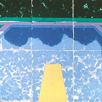
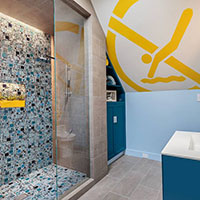
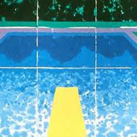
Karter's Bath is for a 9-year old boy. The family loves modern art, so we turned to David Hockney’s Swimming Pool with Reflection for inspiration. We wanted to bring the energy of this piece to life in color, texture and light and we are so pleased with the results.

Please stop by for a peek before the showcase house closes on Memorial day, Monday May 25th.


San Francisco Decorator Showcase - Bathroom Fetish

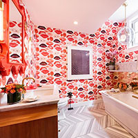
lips bath by rob j photos Image by Rob J PhotosWell, we all did it! Opening night at the 2015 San Francisco Decorator Showcase House was a night to remember. Congrats to our fellow designers, your rooms are inspiring and oh so cool! On trend this year are textured and patterned wallpapers, high gloss reflective ceilings and draperies with gorgeous adornments. Many of the spaces take on a very masculine or feminine feel.

Since we designed Karter's Bathroom this year, this post is dedicated to the bathrooms in the house. These rooms go beyond utilitarian; they're space to brighten your day, to soak in, literally and to refresh your soul.

Karter's Bathroom, for the families young, sophisticated son, was inspired by the David Hockney piece "Swimming Pool with Reflection". The over scale "No Diving" wall/ceiling art, installed by San Francisco Graffiti Artist Jeremy Novy is a playful nod to the swimming pool diving board and the modern art piece Atmosphere River V, 2015 by Artist, Hunt Rettig in synthetic rubber and acrylics encapsulated in a polyester film, read as sunlit water in the pool. Big thanks to Lisa Chadwick and Melanie Ross at Dolby Chadwick Gallery for providing the artwork in our space this year.

For the families daughter, Nest Design created the ultra feminine, Lips Bathroom. The vanity sconce light fixtures are a must see! Thank you Rob J Photos for the images.

Two other spaces with feminine appeal is the ultra glam En Vogue Salon designed by the fabulous Tineke Triggs of Artistic Designs for Living. Every detail in this space was accounted for, from the mesh fabric used as window sheers to the ceiling treatment. I want to live in this space! Julie Rootes designed the beautiful Powder Room full of glitz and glamour. That tile, that sink, that wallpaper, need I say more!

There are so many more amazing spaces to mention, but so little time. Please visit the showcase house and see for yourself, but if you don't have the chance, SF Curbed showcases the house in all it's glory, thanks to the amazing photography by Patricia Chang Photography. Check out the house here.


Demo Done. Hard Hat Party On!

usfhs logo damien hirst artBeing a part of the San Francisco Decorator Showcase is not all work, and no play. With demolition complete, our California Cool Bath project is moving along as planned. So with work in order, we will play. The Decorator Showcase House is in demo mode, so why not have a party? That's exactly what happened. Last week we attended the 1st of many parties for the showcase house - The Hard Hat party. A time to appreciate the beautiful 9,700 sq ft home designed by Architect Julia Morgan and to catch up and connect with fellow designers and vendors.

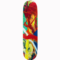
Connecting we did. It was so awesome chatting with Alexandra Ray of Five Senses Art, about that perfect piece of art for our showcase room. Thanks for sending your ideas, Alex! Love the idea of a skateboard for a young boy's space - Spin Yellow, 2009 by Damien Hirst is super cool.

Also a big thanks to Thelma Garza, Director of Events and Special Projects at San Francisco University High School for keeping us in the loop and making things happen!

Looking forward to the April 25th Opening Party to be blown away by all of the creativity and sheer gumption from the many top designers of this years showcase house.

The Start of a Quinquennial?

hockney poolpromoted-media-optimized_54d521943f939We're so excited to be one of the few design firms selected in this year's San Francisco Decorators Showcase home. This year we're creating a California cool bath for the couples' young son, inspired by David Hockney's 1978 art piece "Swimming Pool with Reflection". So why a quinquennial? Five years ago we paired up with Helena Jausas at Spec Ceramics, here in San Francisco, for the 2010 Decorator Showcase to create one of DM+A's most published bathrooms. Once again, Helena has donated tile that has the look and feel of a swimming pool deck, On Square in Cemento by Emil Ceramica. Giant hugs and kisses to her for helping us realize our design on this very tight budget.
Looking forward to collaborating on another fabulous project and continuing what looks to be a 5-year tradition!


Another Year of Building Joy

IMG_0109Just over 20 years ago, Laura Seccombe started a tradition of spreading joy to the children at the Edgewood Center for Children and Families, here in San Francisco.  In 2008 Gregg De Meza continued this tradition and this year was no different. The festivities commence after work on the Wednesday before the Saturday event with food and drink at the DM+A office. This year Gregg had Deviled Crab flown in from Tampa (whoa). They look like giant Easter eggs coated in bread crumbs, but when you cut into them, instead of yolk, you find luscious crab meat - YUM!
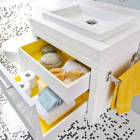
Now that the workers are fed, let the construction and competition (this year was girls against boys), begin. Two hours later and lots of libations, then voila, the office is transformed into a little city of 45 gingerbread houses. Awe, the office smells so amazing.

Saturday arrives and we transport all of the houses to Edgewood to meet with the rest of our helpers, comprised of our clients, family and friends. Big shout out to our elves this year, you really made the event a success!

The multitude of candy and icing are set out, so bring on the kids to decorate to their hearts desire. We love seeing the creativity from the little decorators. Some are really master craftsmen, putting a lot of focus on the shingles and cladding of the house, while others emerge as fine landscape artists, creating shapely trees and shrubbery out of ice cream cones and puffed cereal.

The event is wrapped up with the kids taking their finished gingerbread house to snack on for the rest of the year and leaving us feeling very thankful that we can start our holiday season building joy and laughter with the children at Edgewood.

Cheers to a Wonderful Holiday,

The DM+A Elves

Bathroom Tile Love

bath-tile-de-meza-architecture- dw0313_spello_02Thanks Style Carrot for the feature of our Bathroom Design for the San Francisco Decorator Showcase in your recent post on Contrasting Bathroom Floor Tiles. Cool choice of patterns, scale and color. In particular, we adore the hexagonal tiles by Italian designer, Paola Navone.

We look forward to seeing more of your finds.

Lava Mae, Wash On!

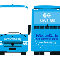
bus image shower imageLava Mae, you have inspired us to be nice. Your service providing mobile showers for the homeless is such an awesome service. For most of us, we take taking a shower for granted, but here's why it's so challenging for the San Francisco homeless to get clean and why Lava Mae rocks!  

  • There are only 8 places in the city offering showers for the homeless.
  • Most are centrally located making it difficult for those who make their homes in other parts of the city to access.
  • With 1-2 shower stalls at best in each facility that translates into 16 showers for the 3,000+ men, women and children living on the city’s streets


Speaking for myself, and having a baby to tend to now, I understand how something as simple as getting a shower in can breathe new life into your day and soul for that matter.

Hey friends we just made a donation to provide 200 showers to refresh our homeless. Click here to do the same!


Elevated Views

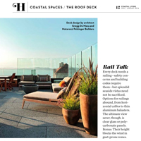
logo page12Thank you Coastal Living magazine for the write up in the July/Aug issue. The Jackson St. roof deck project in San Francisco provided an additional 1,000 sq. ft. of living space; perfect for entertaining high in the sky.

Glass panels were the optimal choice for unobstructed views of the Golden Gate Bridge and the beautiful bay while also providing much needed wind protection. Durable and low maintenance finishes are a necessity for outdoor spaces. Ipe wood juxtaposed with lava stone tiles provide texture and warmth to this modern space.

Here at DM+A, we are all about the animals. We all have pets we consider family members, so another another must consideration when designing with glass panels is for the birds. Gizmag shows a cool example of bird-protection glass and what humans see vs. what birds see.

Let us know if you have a rooftop area that you're interested in developing into a useable space and we can do a feasibility study for you.

Enjoy the summer!


Time to BBBe Nice

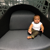
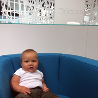
grey in gray chair greyteknion babyblueslogo Just wanted to give a shout out to Teknion and B&B Italia for the hospitality at the recent Bourbon and BBQ event at their San Francisco Showroom.

A big YUM for the mac 'n cheese and BBQ from Baby Blues. My little guy, Grey, had all smiles for the server too. As soon as he can eat, I will definitely be bringing him to Baby Blues!

The showroom revamp is very cool. Sweeping city views and the seating options were so irresistible we had to photograph the Baby in every piece.  My personal favorite is Teknion's Fractal chair upholstered in Magnify (Gray) - such a beautiful piece and the sheen and texture of the fabric is gorgeous.

Thanks again Teknion for sharing!

HGTV + Showcase House = Good Times

jonathan rachman entry HGTV Party at 2014 San Francisco Decorator Showcase House

We've been having so much fun at all of the industry events this year and recently attended the HGTV party at the 2014 San Francisco Decorator Showcase. The annual Decorator Showcase benefits San Francisco University High School's Financial Aid program. The Pacific Heights mansion showcased work from the Bay Area's top interior and landscaping design firms.

This year we noticed the overall trend was the use of gold starting at the entry/foyer, designed by Jonathan Rachman. Loved, loved, loved the cowhide rug with the gold splatter in true Jackson Pollack style. We moved on to the dining room where I had to take a closer at the matte gold flatware (so cool), yep, my curiosity caught the attention of everyone in the room including the designer, George Brazil of Sagrera-Brazil Design because, of course, the flatware was attached to the table!

Moving on, I have to give a shout out to HGTV and Hannah Shipley. You are the hosts with the most! As you all know, we DM+Aers are indulgent when it comes to food + drink. Our glasses were never empty and the blue cheese cheesecake bites were so heavenly. I must have the recipe, so if anyone has it, please post! Onward to the next event.

To Bidet or not to Bidet

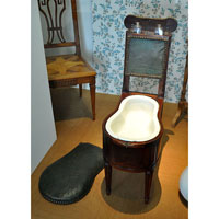
431px-231_Bidet_Karlsruhe_c1810 Cat In BidetBidets started out as a chamber pot in the bedroom and with modern plumbing it was brought into the bathroom.  Don’t confuse the bidet with a toilet even though they look similar.  Once you do your business in the toilet you then would transfer to the bidet to clean yourself using a jet of water.  You can straddle the bidet in either direction, depending on what you want cleaned.  A bidet is often considered better for personal hygiene.  It allows a hands-free and superior wash in place of wiping and occasionally irritating action of toilet paper. There are two types of bidets, conventional and attachable.  Conventional will require additional plumbing and space in your bathroom, but it will last a long time.  Also when paired to match your toilet, it can make your bathroom more elegant.  The attachable can come in a non-seat and seat-type.  They are inexpensive, easy to install, and can come with a lot of convenient features such as wireless remote, automatic deodorize, multiple nozzles, etc.  Since they are an attachment, the look is techier and would be harder to make the bathroom more seamless in the design aesthetic.   With these options persons with various incomes can afford a bidet.  But whether or not you choose to use a Bidet, we do know that that is still the question!

Happy 33 to Me!

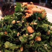
hillstone w greykale saladThree is my lucky number since the 3rd grade : )  So it makes sense that I feel turning 33 will be a good year for me.  For this birthday lunch, I wanted to go to Hillstone Restaurant.  Many of you may also know it by its former name of Houston’s.  It is a classy and respected eatery along the Embarcadero in San Francisco.  I especially love coming here to have their Kale salad.  It has a roasted peanut vinaigrette, which is to die for! I was so obsessed for this dish, that I scoured the internet and found someone who attempted to recreate it.  The recipe is pretty good, but I always feel it isn't perfect yet.  So coming back I get to determine what I am missing.  Go ahead and give both a try.  I'll finish with a Happy 33 to Me!